LOUISVILLE, Ky. — Death trends usually trail case trends by weeks or even a month. That is because the virus can take a long time to run their course and it can take weeks or months for those infected to succumb or overcome the illness.
INDIANA

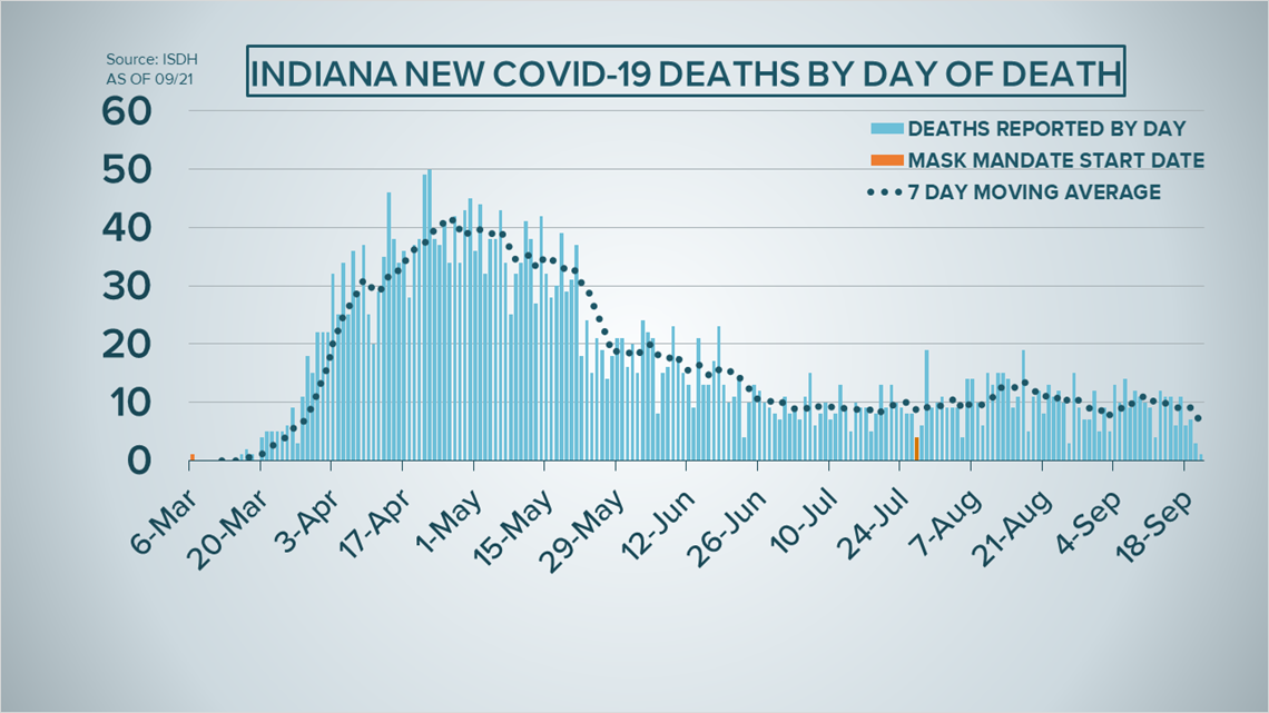
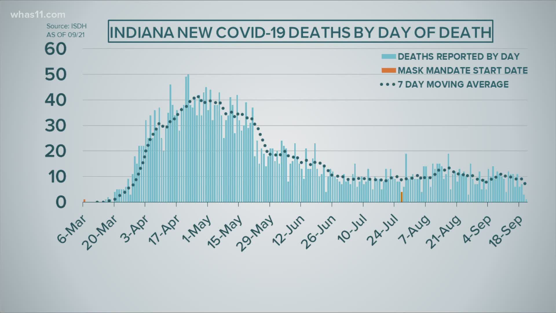
The bars rise to represent the deaths by the day they happened.
Those dates are along the bottom.
If you follow that dotted trend line to the far right...
You'll notice after a slight rise in the past two weeks -- the death trend is slightly down.
Since the numbers are based on the day of deaths the Indiana State Department of Health updates their historic data as more deaths are reported to them, so this trend could change.
A bonus graph, this graph compares the case and deaths by day.

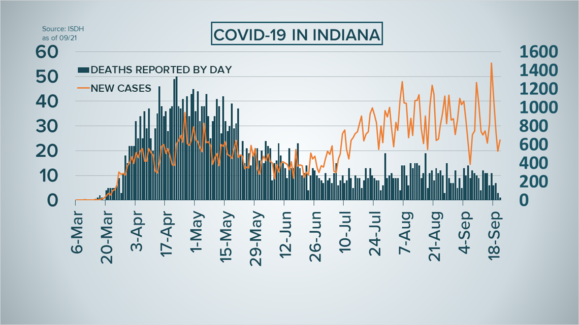
Luckily, there are fewer deaths than cases that is why you'll notice there are two axis or sets of numbers on the side of the graph.
The bars show the deaths where at the lines show the new cases.
The numbers on the left reference the deaths shown by the bars while the numbers on the right axis reference the new cases shown by the line.
The true death rate can not be determined until there are no more cases of the virus because some patients infected will recover but using the current data, nearly 3% of those infected have passed away with the virus.
KENTUCKY

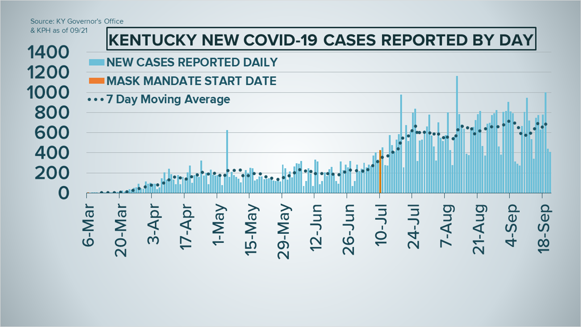
A look at the deaths since the start of the pandemic.
It appears average deaths are trending down after a series of increases just days ago.
Reminder, Kentucky reports deaths differently.
Instead of the day of death -- the bars show the deaths reported to the state on that day.
That means we do not know when the deaths actually occurred --
making conclusions harder to draw from this data.
Here's a bonus graph.

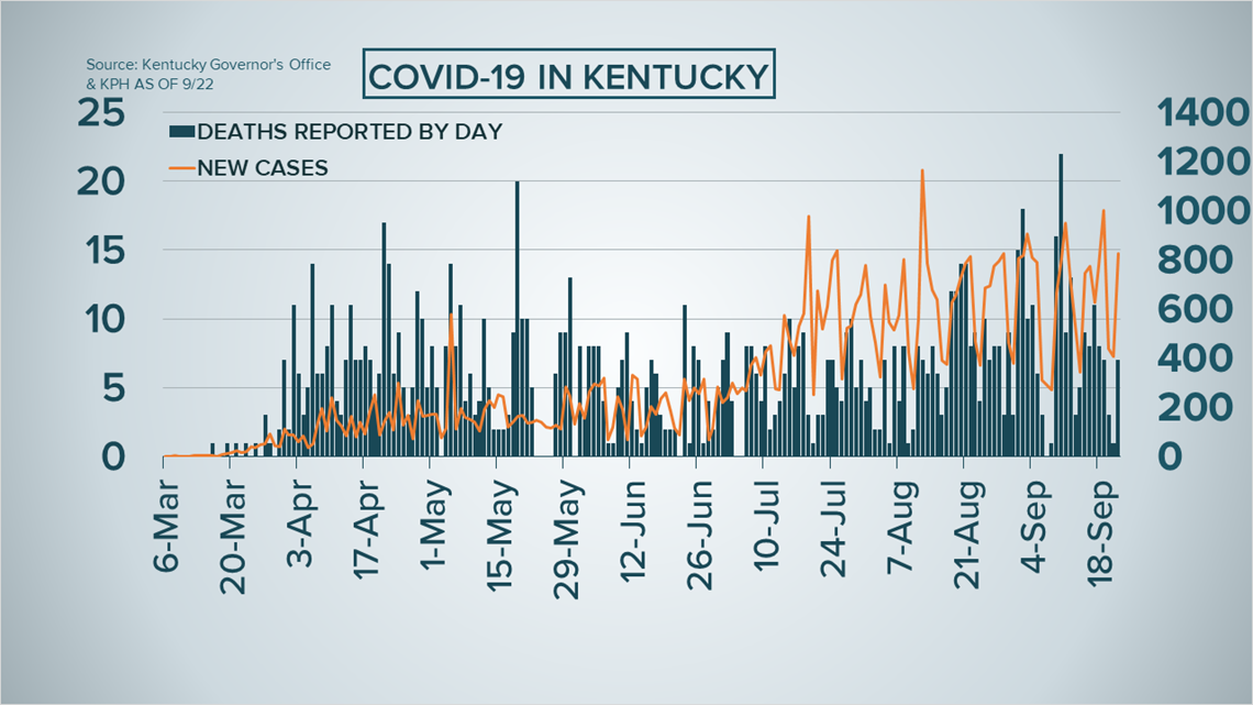
Again, the bars show the death toll and are reflected by the numbers on the left.
The orange line shows the newly reported case counts connected to the numbers on the right.
Using the current data nearly 2% of that positive pass away with the coronavirus.
►Make it easy to keep up-to-date with more stories like this. Download the WHAS11 News app now. For Apple or Android users.
Have a news tip? Email assign@whas11.com, visit our Facebook page or Twitter feed.

