LOUISVILLE, Ky. — It can take days or weeks before someone with the virus shows symptoms. A patient's battle with the deadly virus can be weeks or even months. That is why death trends can be the last to show the impact on our community.
The FOCUS team is breaking it down to see what the data shows.


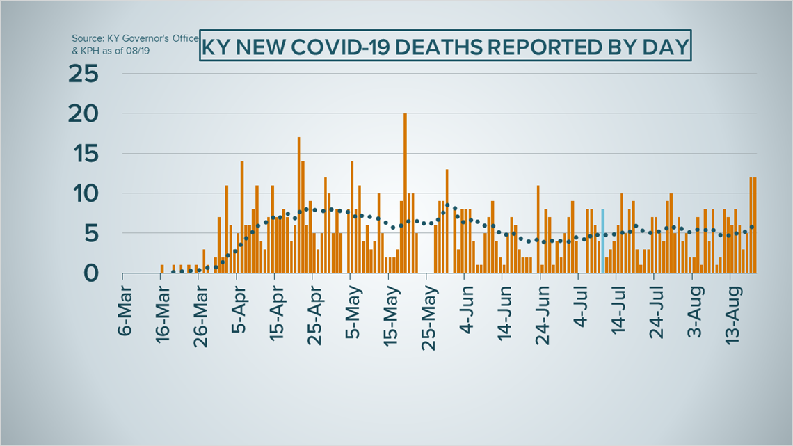
The graph above shows the the deaths reported each day in Kentucky since the start back in March. Each orange bar shows daily deaths and we've marked the mask mandate start date in blue.
That dotted trend line tracks the 14-day average. Follow that bouncing line to the far right and you'll notice higher death counts are driving that trend upwards.
We predict that death counts will stay steady or increase, mirroring case trends currently flattening at a high level.
To put that in perspective, only about 2% of all those positive have passed away because of the virus, according to the latest data.
A total of 842 Kentuckians have died since the first case on March 6 and 9,331 have recovered, that's about 23% recovery rate.


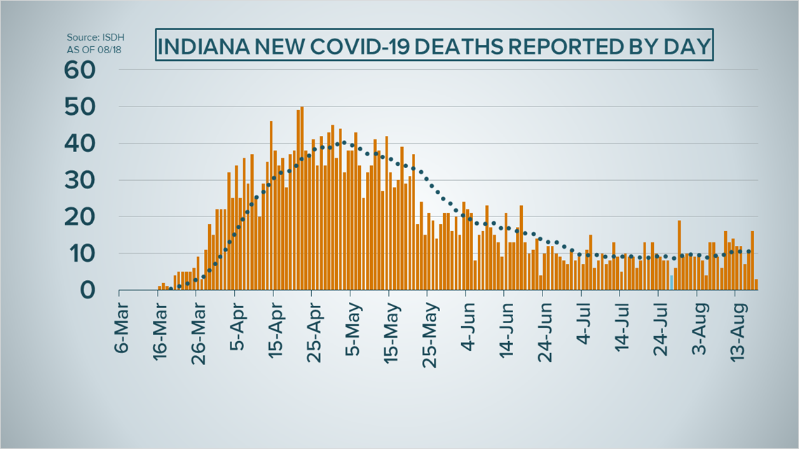
Turning to Indiana, the graph above is similar but the data is telling a different story.
You'll notice the trend line peaked in late April. Moving to the right, there is a quick downturn by then end of May. Then the daily death toll appeared to flatten by then end of June and into July.
Since July had some record-breaking case counts the death trend started to level.
On the far right, that line tilting up slightly as death toll catches up with the higher case counts we've seen. To put that into context, 2,968 Hoosiers have died due to the virus; that is about a 3.6% fatality rate.
As always, FOCUS keep diving into the data to bring you a deeper understanding.
►Make it easy to keep up-to-date with more stories like this. Download the WHAS11 News app now. For Apple or Android users.
Have a news tip? Email assign@whas11.com, visit our Facebook page or Twitter feed.

