LOUISVILLE, Ky. — As thousands take to the streets demanding change in systems that perpetuate racial inequalities the current pandemic points to proof of disparity in health care.
Our FOCUS team is digging into that data showing the coronavirus is killing African Americans at a disproportionate rate.


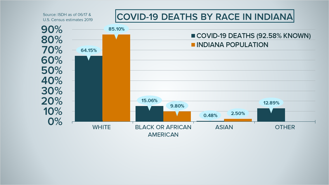
The graph above shows the percentage of total deaths by race in the Hoosier State with the blue bars, compared to the U.S. Census population data in Indiana indicated by the orange bars.
You'll notice, the only group with a death rate higher than the population they represent is African Americans, the only group where the blue bar is taller than the orange bar.
In fact, you'll see 15% of the deaths in the state are African Americans but the states African American populations is about 10%, that's nearly double the population.
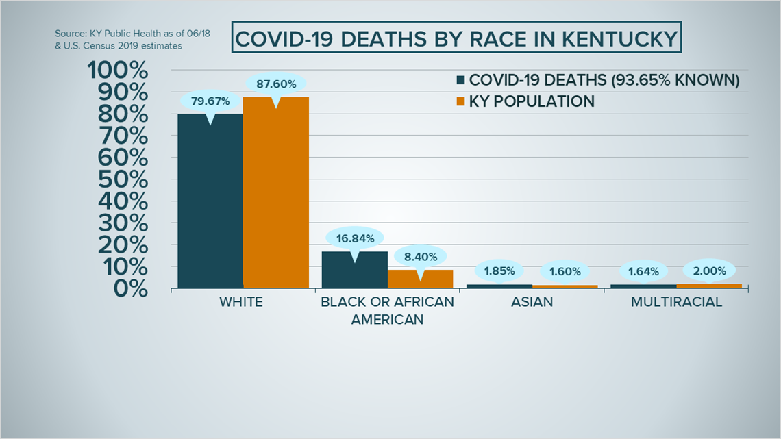
In Kentucky, the divide is a tad deeper.


You can see the virus is killing twice as many African Americans when compared to the population. Again, the blue bar is taller than the orange bar.
And that isn't the only group dying at rates disproportional to populations. You can see Asian Kentuckians are dying at a slightly increased rate as well.
It is important to note, there is a small percentage of cases in each state where racial data is unknown so these racial disparities could be even deeper.
►Make it easy to keep up-to-date with more stories like this. Download the WHAS11 News app now. For Apple or Android users.
Have a news tip? Email assign@whas11.com, visit our Facebook page or Twitter feed.

